
A law firm website has one job. Turn a stressed person at 10 p.m. into a phone call or a form fill, and do it without tripping a bar rule. Too many law firm website design projects aim at something else, a site that wins a design award and quietly leaks every case that lands on it. We build and review a lot of attorney sites, and the ones that sign cases share a handful of traits that have almost nothing to do with the hero image. Here’s the anatomy, in rough order of how much money each piece moves.
The phone number is the most important design element on the page
Personal injury, criminal defense, family law. In most practice areas the person searching wants to talk to a human now. So the first thing we check on any law firm site is whether a phone number is visible, tappable, and tracked without scrolling or opening a menu on a phone.
Most aren’t. The number sits in a footer, or it’s an image, or it’s a plain text string that doesn’t dial when tapped. On mobile, where the majority of legal searches happen, that’s a leak you can fix in an afternoon.
Put a click-to-call button in a sticky header. Pair it with a short form (name, phone, a one-line description of what happened) so people who won’t call at 10 p.m. still have a way in. Every extra form field costs you submissions. Ask for what you need to call them back and stop there.
Your homepage should answer three questions in five seconds
Where do you practice, what do you handle, and why you. Not “Experienced. Aggressive. Trusted.” Every firm says that, and visitors have learned to skip it.
Say it plainly. “Car accident and truck crash lawyers in Tampa. Free case review. No fee unless we win.” That’s a headline. It tells a scared visitor they’re in the right place, and it hands Google a clear signal about what the page is.
The “why you” part is where most firms go vague. Pull something real. Years in practice, a specific result you’re allowed to cite under your state’s rules, the fact that the attorney personally answers the phone. One concrete detail beats a paragraph of adjectives.
Build a page for each practice area, and then a page for each city
The single most common structural mistake on attorney sites is one “Practice Areas” page with a bulleted list of everything the firm does. That page can’t rank for anything specific because it isn’t about anything specific.
Each case type that pays the bills gets its own page. Truck accidents. Wrongful death. DUI defense. Each one should be written for the person facing that exact situation, covering what happens next, what the process looks like, and what to do in the first 48 hours.
If you serve more than one city, location pages help too, but only when they say something true about that location (courthouses you work in, local court quirks, the neighborhoods where you take cases). Thirty near-identical pages with the city name swapped out are a quick way to get ignored. This is also where law firm website design connects to SEO. We cover the ranking side in our guide to SEO for lawyers, and the website structure has to support it before any of that works.
Attorney bios do more selling than the services pages
People hiring a lawyer are hiring a person. The bio page is usually one of the most visited pages on the site, and it’s usually the worst one on it.
A good bio has a real photo (not stock, and not a 2014 headshot), a short story about why the attorney does this work, and the credentials that matter to a client, not the ones that matter to other lawyers. Law review is great. “Recovered funds for clients who were told their claim was worth less” is what the person reading actually wants to know.
Add a short video if the attorney is comfortable on camera. Forty-five seconds of someone talking like a normal human lowers the barrier to calling more than any paragraph of copy.
Handle bar advertising rules in the design, not as an afterthought
Legal advertising is regulated state by state, and the rules reach websites. Disclaimers, testimonial restrictions, rules on past-result language, rules on terms like “specialist” or “best”. We’re marketers, not your ethics counsel, and you should run your own site by whoever handles compliance for your firm. But from a design standpoint, here’s what we plan for from day one.
Disclaimers need a place to live that doesn’t wreck the layout. A short, readable line near results or testimonials, plus a full disclaimer page linked in the footer, works in most states. Case results should carry context (“results depend on the facts of each case”) in the same view as the number, not buried three clicks away.
Fix this up front. Retrofitting compliance onto a finished design is how you end up with a gray block of fine print stuck on top of a beautiful page.
Speed and mobile aren’t extras
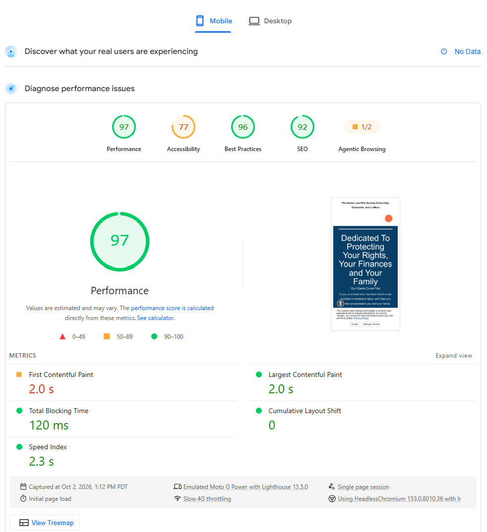
Google measures Core Web Vitals and so do your visitors, whether they know the term or not. A law firm homepage carrying a 6 MB autoplay video will feel slow on a phone with two bars of signal, and that’s exactly the phone your best leads are holding.
Compress images, skip the autoplay hero video, and test the site on an actual mid-range phone over cellular, not on your office Wi-Fi. If you’re on WordPress and Elementor (which we build on), a lot of the speed work is about restraint. Fewer widgets, fewer plugins, lighter fonts. Pretty and fast are compatible. Pretty and bloated aren’t.
So how much does a law firm website cost?
It’s one of the questions people ask most, and the honest answer is a wide range. Template-based builds can land in the low thousands. A custom site with original copy, photography, and practice-area pages often runs well into five figures, and large multi-office firms go past that. What you’re paying for is mostly the content and the strategy (the writing, the page structure, the tracking), not the colors.
Here’s the part nobody tells you. The cheap site and the expensive site can both fail if nothing is measuring what happens on them. Which brings us to the piece almost every firm skips.
Track every call and form, or you’re guessing
A site that “gets leads” is meaningless until you know which leads. Set up call tracking (CallRail or similar) with a dynamic number swap, track form submissions as conversions in GA4 and Google Ads, and filter out the spam and the wrong-number calls so your numbers reflect real inquiries.
Then go one step further and tie signed cases back to the source. In legal the gap between click and signed retainer can be weeks or months, so the only way to know whether the website is working is to connect intake outcomes to the visit that started them. We walk through that setup in our post on lead attribution. Without it you’ll redesign the site every two years based on vibes.
Do one thing this week
Pull up your own site on your phone. Don’t use your office Wi-Fi. Try to call the firm without scrolling. If you can’t do it in under five seconds, you’ve found your first fix, and it won’t cost you a redesign.
